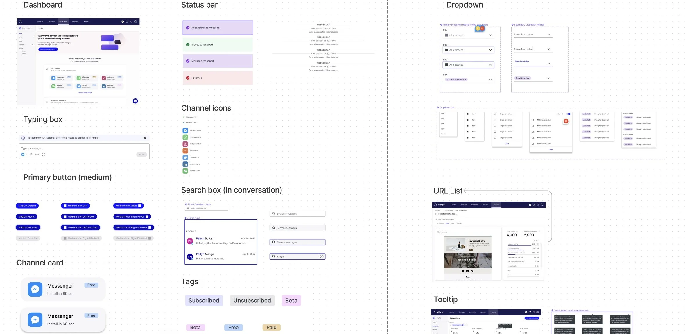
Design System Rebuild & Tokens
Project Summary
The need for a new design system arose from an accessibility audit conducted by the Centre for Inclusive Design. The audit revealed that our components (UI Library 2.0) scored 57% Accessibility Compliance against the WCAG accessibility standards up to and including 2.1 Level AA.
To create a Design system that passes AAA+ accessibility standards and creates consistency, autonomy, cost savings and increases work efficiency, we re-introduced a new design system using the Material UI (MUI) component library and utilized the design tokens to maintain a consistent visual language throughout the product.
This solution streamlines the design and development processes, increases efficiency by 60% and achieves inclusivity through high accessibility standards.
My Role
Design Lead
Tools
Figma, Figjam, Figma token, MUI
Skills
Workshop, Facilitation
Communication, Presentation
Problems to solve
Besides the components scoring 57% Accessibility Compliance against the WCAG standards, the existing design and development process shows the following problems:
Dependent on human communication to ensure changes made in Figma are updated in code
Maintenance & governance are required to ensure the storybook is up to date
High maintenance costs are required from both the design and developer team
#How might we
Streamline the process to enable both designers and developers deliver the high quality and consistent product?
Solution highlights
The implementation of the accessible tokenised design system enables us to:
Manage and update styling easily by pushing the JSON file to GitHub
Apply different themes to design in one click
Design inclusively, such as enabling the voice-over tool
Increase design efficiency by 60% in average
View design process below
Solution Exploration
Material UI is the chosen component library to ensure we pass accessibility standards, mainly because it’s compatible with the current tech stacks, and suits most of the design needs.
However, the problem of the inefficient process between design and development still exists.
We compared two options to help streamline this process:
MUI Theme creator
Design tokens
The theme creator can be easily implemented by developers, however, it still disconnects from Figma, with limited styling options and coding skills required to customize changes.
Design tokens were the chosen solution because they contain all the design decisions and are stored in a centralised location that developers and designers can easily access and apply.
This allows for faster and more efficient design and development processes and easier maintenance of the product’s visual style.
Implementation
I ran a few workshops to understand and analyse the styling of the existing components, which helped us consolidate and develop a two-layer token structure for the new design system.
core tokens were used to define the global visual style including colour, spacing, border-radius etc
semantic tokens were used to communicate the context and intended purpose of a token. (Note: we mainly apply semantic tokens for colours)


